Why Conference Badge Designs Matter
Creativity
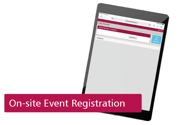
Most organisers spend a lot of time and money making sure the branding is strong across all areas of their event. From the initial website and online registration system through to the post-event communications.
So it makes sense for that to apply to the conference badge designs too. People will be looking at name badges throughout the entire event and so creative and on-brand conference badge designs is key.
Don’t feel limited to standard formats. Use the colours, fonts and design style that fits with your brand to make maximum impact.
Clarity
It is important that delegates can know who they are speaking to at a glance as well as being able to identify the badge with the event branding and so core information should be displayed as large and as clear as possible.
We usually advise creating conference badge designs to feature the key data (usually name and company) as large and as clear as possible but to be able to do that, the branding and any logos need to be laid out in a way that leaves sufficient space. It’s not uncommon for names to span two lines and some of the job titles we see are enormous!
Consistency
A logo isn’t always necessary and sometimes, rather than put the event logo on the badge, you can simply use colours and backgrounds that obviously link to the event theme – saving you that all important space. Think about the other things you might need on the conference badge design: a barcode, session choices, wifi password etc (and allow enough space for them too).
If you have other event collateral, like show guides or printed conference agendas, then ensure there is design consistency across everything. A good conference badge designer will be able to do this regardless of the print materials, sizes, orientation etc.
Colour & Symbols
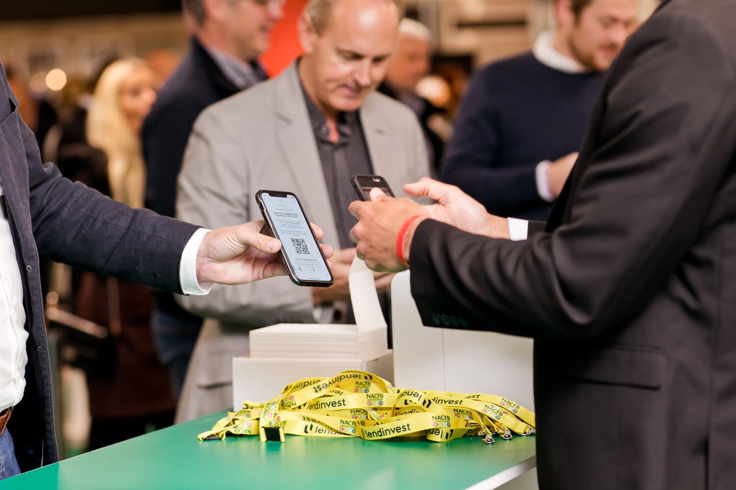
Colour can really help differentiate between attendee types and our full colour expo badge printers can be used to automatically print the right design onto the right person’s badge as they arrive. It’s super fast and there is no real limit to the number of design variations.
Symbols are sometimes better than words. For example, an asterisk for a new customer or the letter E for exhibitors. With careful thought, it’s amazing what you can fit onto a conference badge design and still ensure it is legible.
Conclusion
Having created thousand of conference badge designs over the years, we’ve seen it all. If you need any further advice or support on what badge style, size or design will work best for your exhibition or conference then please do get in touch.
Helping you to finalise the badge design is part of our service. We’ve done a fair few in our time and are happy to help get it right for you.
Featured Services

Who we are
Event Connections provide exceptional event registration and delegate management services to event, conference and exhibition organisers.